You’ll never have a second chance to make that first impression – which is why your website’s design is undoubtedly one of the most critical things you should pay attention to.
Within 3 seconds, website visitors will decide whether to engage with your website or leave. Even though your website is probably chocked full of quality information that the visitor would be interested in, the general flow and look of your site can be the deal maker or breaker.
According to Adobe, “given 15 minutes to consume content, 2/3 of users would rather read something that’s beautifully designed than something plain.”
For every company, the website design, especially the homepage design is its virtual front door. If a new user doesn’t like what he sees, his knee-jerk reaction is to simply hit the “back” button, and go visit one of your competitors.
That’s very correct – unfortunately, most people still judge a book by its cover.
In a nutshell, web design is such an exciting industry to be a part of, especially when you get to see some lovely and innovative designs. However, while there are a considerable amount of functional, beautiful websites on the internet, there are also a lot of poorly-designed websites that don’t help the end user.
When designing your website, there are several factors to consider in building an impressive, streamlined, and user-friendly experience.
In this guide, I’ll show you 15 website design best practices to that will help you to increase conversion.
- Responsive Design
There’s no denying the fact that responsive web design (RWD) is the bee’s knees right now. It encapsulates everything you can use to describe UX — from color schemes, easy-to-use navigation, user-friendly fonts, simplistic and useful design, adaptive orientation and resolution, page rendering to lightning page speed.
You can seamlessly use flexible layouts and grids, robust CSS and your intuition in website design. That’s exactly what responsive website design entails; it responds to users’ needs in any device — be it mobile or desktop.
RWD has gained a lot of popularity and usage in the UX field. The elements evolve as technology continues to grow.
According to Google:
“Responsive web design is a setup where the server often sends the same HTML code to every device and CSS is used to adjust the rendering of the webpage on the device. Furthermore, Google’s algorithms should be able to detect this setup automatically if all Googlebot user-agents are permitted to crawl the page and its assets (JavaScript, images, and CSS).”
In simple terms, responsive design serves all devices with the same code that adjusts for every screen size.
According to Zenith Media, “mobile devices are expected to reach 79% of global internet use by the end of 2018.”
Now, while designing your website, it’s vital to ensure that it can easily adapt to every screen resolution and any device.
You might build a great website that looks magnificent when viewed on a desktop or laptop – but when being displayed on a cell phone or tablet, it becomes very cluttered and hard to navigate. And if that’s the case, you will lose potential customers.
Responsive design adjusts to the size of your browser automatically, making it a lot easier for website users to find all the information they need without stress.
According to a report by the Society of Digital Agencies (SoDA), “77% of agencies believe that poor website user-experience is a weakness for their clients, making poor user-experience the most significant weakness agencies identified.
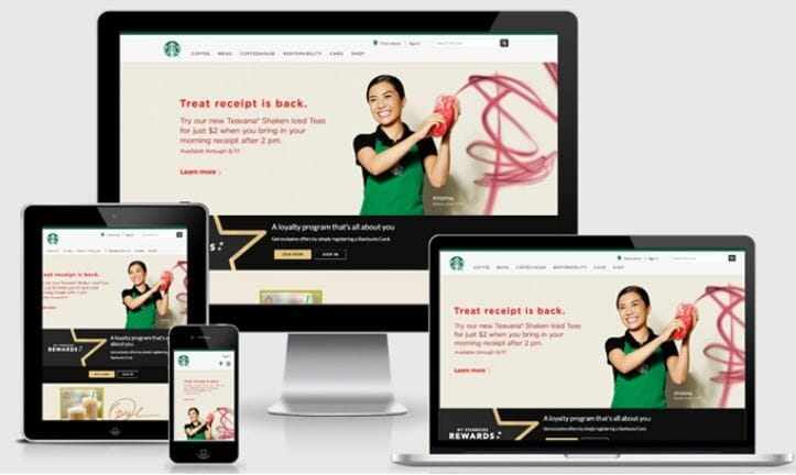
A perfect example of a website with a responsive design is Starbucks. They used the traditional grid design to build a snappy, functional mobile website which includes a handy store locator:
Typically, creating this type of website is not all about changing a few lines of code on the website. It requires fluid grids, some mathematical calculations, and the ability to decipher target elements.
Building your skills in responsive design as an expert web designer is a brilliant idea. However, if you’re an occasional designer, you may consider looking into a template which has the responsive design element already embedded into the code.
For example, WordPress is an excellent way to create a quick website with responsive design as it has numerous themes that are responsive. The disadvantage to using WordPress though is that some elements of the page can be challenging to change.
The code can be easily manipulated but can be hard to navigate through and to decipher what code relates to what page element.
However, if you decide to add responsive design to your skill set, there are lots of free online resources and tutorials that can help you with that. Just search the web, and you’ll get all the information you need.
That being said, keep these Responsive Website Design best practices in mind:
a). Acknowledge breakpoints: For dramatic page rendering, you’re required to have at least 3 breakpoints: mobile, tablet, and desktop. The rule is not set on a stone, but using five breakpoints will ensure you achieve the most device flexibility.
b). Enhance images: You can’t neglect or ditch fluid images as long as a responsive design is concerned. When using images, don’t only reduce the size, optimize it properly. You may not resize images on smaller screens, but you can crop it to retain their impact and quality.
c). Make the elements flexible: In the UX Design Trends 2015 & 2016, we explained the importance of flexibility — is the key point for responsive design. The layouts, image sizes, text blocks, and everything must be flexible. Use smart CSS media queries coupled with this malleability to give your website the fluidity it needs to fit inside any device or container.
d). Use Scalar Vector Graphics (SVGs): If you want to see a responsive design that users love, then make up your mind to use SVGs for the best quality regardless of the device.
Raster graphics are not recommended for this purpose because they deal on pixels. You should use SVGs because they alter their resolution based on image paths, which means they maintain their clarity across devices at any size.
e). Consider card interfaces: Since the rectangular shapes of a Card UI act as “content container” that are easier to modify, it can prevent and eliminate a lot of stress in a responsive design.
f). Focus on minimalism concept: This is a critical practice you must adopt in your website designs, especially in responsive website design. It’s like devising a means to fit the same amount of luggage into different sized suitcases.
Obviously, the lesser your luggage, the easier can achieve results. Optimum website performance and Responsive-friendliness are the core reasons why minimalist interfaces are so prevalent in modern web design.
g). Large clickable area for buttons: Fitts’s Law explained that the larger the clickable area in a button, the easier the user can interact with it. Of course, it makes more sense when the button size fluctuates. For mobile-friendly designs, endeavor to use tappable buttons with at least 40 points.
h). Design the smallest screen first: When you focus your design first and foremost on the smartphone layout, you are on the right path — because it will help you separate the essential elements from others. It’s much easier to add more features as you scale up is much than cutting as you scale down.
This is one of the mistakes that most website designers make. Meanwhile, it should form the culture of your design with respect to responsive web design. More so, the lessons you learn on the way will be priceless. So give it a shot!
i). Hide content appropriately: Unfortunately, smartphone screens are small and do not offer enough negative spaces or white spaces. The good news is that desktop screen sizes provide enough breathing space which ensures you take advantage of hidden controls like navigation drawers.
If you want to minimize the screen display or reduce the number of elements that need restructuring, you should seriously consider a progressive disclosure, according to a study by Nielsen Norman Group.
- Focus Your Design on Your Target Audience
What is a target audience and who are you designing for by the way?
It’s always very easy to get caught up in the perception of a website and forget the end-user.
Here’s the fact:
A successful website isn’t merely a lovely visual piece, but a portal for attracting your target audience and providing them with the information they need to decide if they wish to become a new client or not.
Before we start a new website design, for example, we really need to consider the target audience before anything.
- What do they really care about?
- Are they fully aware of the company’s brand or services?
- What makes them the same or different?
- Are there several different target markets?
Regrettably, in a rush and excitement to design a website, it’s often easy to focus more on being impressive and trying to “murder” the competition.
That’s natural, and we all understand the value of representing yourself very well.
But this neglects possibly the most critical element of Internet marketing — one that relates to the potential and future success not only of the website itself but of your overall company’s ventures both online and offline.
The screenshot below speaks volume:
(Source)
It does not matter whether you’re designing a “brochure website” (pages that provide information) or a complete ecommerce website, websites are primarily about communication. The question, however, is: who are you communicating with?
And the answer is apparently the audience for whom it is intended. Your readership – your customers – your target audience.
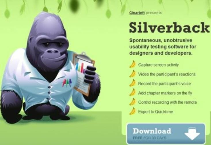
For example, when you visit the website “Silverback,” it contains the necessary information. Above the fold, visitors to this website clearly see a list of what it does, and further down the page, they’ll also see some more details on their service, but only essential information is included.
Another brilliant example is Free Agent. This company provides an online accounting solution for small businesses and freelancers. Its target audience is the average Joe out there who don’t understand the intricacies of an accounting system.
Free Agent effectively made its message highly relevant to this target audience by making it clear that it is “Accounting for the rest of us.”
That means if a prospect has been frustrated by other complex accounting systems in the past, they are likely to instantly have the feeling that Free Agent was built with them in mind.
With this type of design, visitors don’t have to start guessing what it is you offer.
Therefore, always keep your target audience in mind, even when making changes to the layout, design, and images on your website.
- Maintain a Consistent Branding
Consistent branding is an essential aspect of website design. You just can’t ignore branding or approach it with a half-baked approach. You must go all in.
Without a consistent branding, you make your website confusing and stressful for users. For example, we all have that family member or friend who is very unpredictable. You never know what he is going to do/say/wear and they are annoying to have around.
That is precisely how it is with website design. Unfortunately, many brand websites on the internet are like this unpredictable friend. It’s tough to tell what their logo looks like, what their brand colors are, how they are positioning themselves in the market, and precisely what their value proposition is all about.
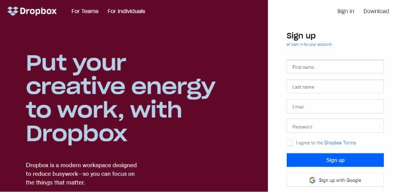
Dropbox (the popular cloud-based file sharing platform) is a perfect example of a company with a consistent brand across channels. You will never find any Dropbox platforms or communication without their signature logo. Dropbox carries its simple design and branding everywhere they go.
Its value proposition is also simple, yet powerful:
“Put your creative energy to work, with Dropbox.”
No need to decipher jargon to determine what Dropbox really does.
One of the best practices in website design is to maintain a consistent branding throughout the entire website just like Dropbox. Only make use of predetermined logos, brand colors, and messaging on each page of the website.
This applies to typography, images, videos, and iconography as well. A brand’s story should be evident and highly supported in the design.
- Easy Navigation
Today, web users want a website that is built to help them save time. They want to able to immediately find what they are looking for, or they will find it elsewhere.
Like hamburger menus, navigation options enhance the searchability and functionality of a website. The first step to making it easy for visitors to navigate your website is to place your menu bar in an accessible and easy to locate position like in your website header.
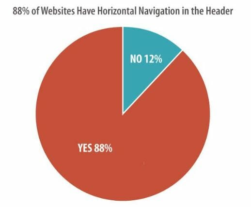
One study found that 88% of websites have the main navigation located in the header, making horizontal top-level navigation a design best practice.
You also want to ensure that your most important pages have the highest accessibility. Let’s consider the other website design best practices to pay attention to:
- Include only five or six options in the menu.
- Give visitors a clear path to find what they want.
- Search bars are expected today.
- Prominently display social sharing, and social follow buttons.
- Make Good Color Choices
When thinking of what colors to use for your website, consider using complementary and cohesive colors which are not overly bright and distracting. One of the worst mistakes you’ll make as a website designer is to use colors that will distract and confuse the user while they are consuming your content.
Many websites use too many colors which often hurt the user’s eye.
Websites with color clashing backgrounds and fonts can be an instant turnoff for visitors and even result in headaches.
Side note: It’s important to have enough contrast between the background, buttons, and text.
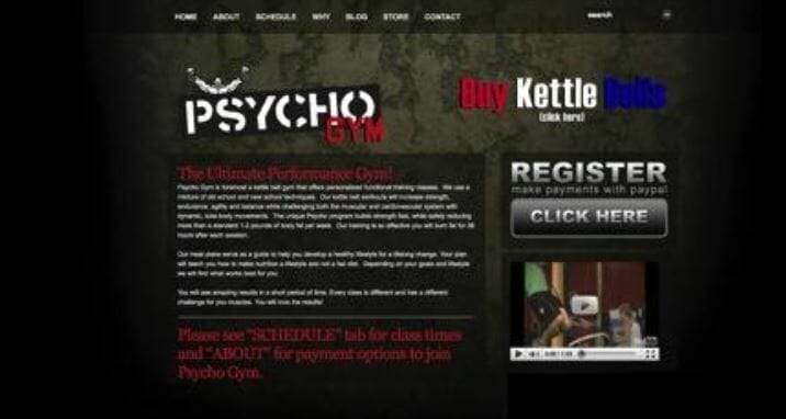
A simple black font on a white or light colored background or a very light font on a dark background is the primary standard for web design. A font whose color is too bright on a light background or vice versa can result in the text not being readable.
Here’s a perfect example of light text on a dark background which isn’t a recommended approach for modern and user-friendly website design.
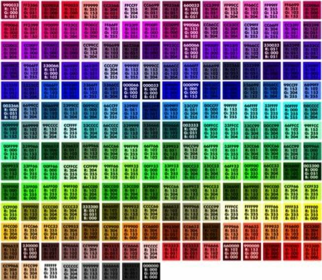
When choosing a color palette, I recommend you use the HTML hex diagram. This diagram contains a list of HTML recognizable colors that can be easily plugged into your website code. The W3schools website has an easy to use HTML color generator that can provide you with any color imaginable.
(Source)
- Keep Background Colors and Images Tasteful
Using distracting colors and pattern for the background can be an immediate turnoff to first-time visitors. Similarly, having too many distracting images and animated backgrounds will detract from the primary message of your website and cause users to look elsewhere.
For a better user-experience, background element is supposed to be consistent with the rest of the page and complement the theme, images, color usage, and the design elements of the page.
For example, Real Estate Special Masters does a fantastic job with a neutral background, making their content to really pop.
- Create Strong Call To Actions (CTA)
The primary goal of a website is to attract visitors and turn them into customers. A website without a compelling and clear call-to-action will not win the customer’s heart.
Even though it might equally be important to educate the visitor on your products and services, the final and ultimate goal should always be to enchant the visitor to complete an action, whether it is to set up a consultation, sign up for a newsletter, register for a free trial, or download a case study.
Strong calls to action are imperative to converting casual website visitors into new clients.
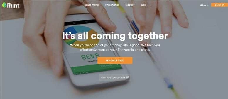
The team at Mint does this well. The homepage contains a simple, direct, and persuasive call-to-action (CTA) copy: “Sign up free.” The CTA design is equally brilliant – the secured lock icon drives home the safety message once again.
Bottom line: Strong call-to-action should be an integral part of the initial web design task, not an afterthought. It’s also crucial that you place them in a suitable place in the layout that makes sense for the target audience.
For instance, a “Contact Us” form may be placed towards the end of the design when the visitor is more educated about a company or brand, while a “Learn More” button may be placed above the fold in the design.
- Use Flat Design
One of the most popular trends in the website design industry today is flat design. With a flat design, you’re expected to remove design elements such as bevels, textures, gradients, shadows, and other three-dimensional effects from graphics.
Getting rid of these elements makes the design to become more simplistic and gives it a two-dimensional feel. The idea behind the flat design is to build a more digital interface which is being incorporated into new operating systems and technological devices.
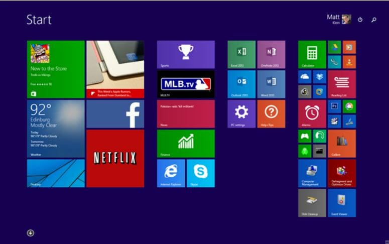
A flat design highlights a minimal approach which corresponds to the trends we see in simplistic website design. Check out Microsoft’s operating system, Windows 8.1, and you’ll see the trend of flat design being leveraged in the layout of their application buttons.
The clean look of their application layout has promoted easy usage and accessibility as presented on the “Windows 8.1 Start Page.”
You cannot use the typical design tactics to make a button stand out when creating a flat design. When trying to create a button using flat design, you have to think of aligning your buttons in a grid and making use of color contrast to make the object look like a button. However, remember to make the buttons as simple as possible without it losing its purpose.
Hongkiat has useful resources that can help you to achieve a flat website design; you may want to check it out for a better understanding of this subject.
- Broken Links are Bad News
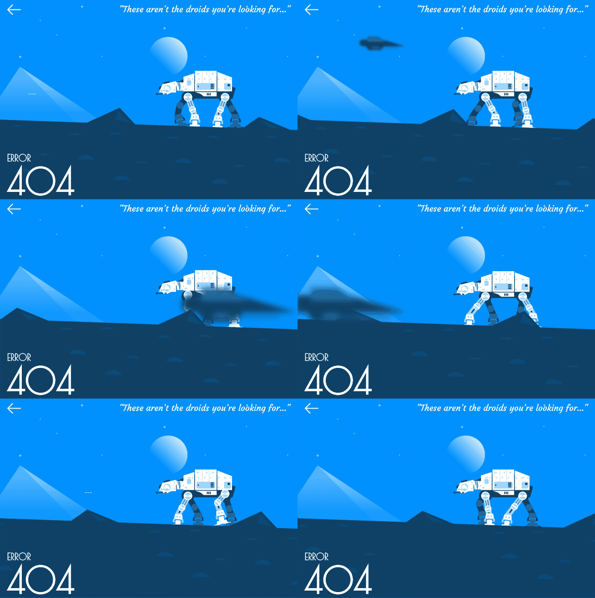
Nothing can be more frustrating and annoying when you visit a website, find an interesting article, click on a relevant link, and see the dreaded “404 Not Found” error page. As much as possible, ensure that every single link on your website directs the visitor to an existing page.
When a user lands on your website looking for information and clicks on a dead or broken link, it makes your website seem unreliable and outdated.
You need to regularly check your links (both internal and external links) to ensure they are still valid and alive. If you see any broken link on your web page, remove it immediately and find an appropriate replacement.
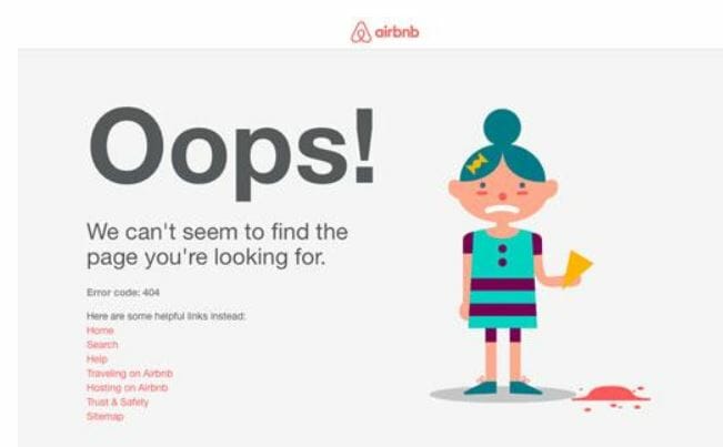
Meanwhile, make sure you design a custom 404 error page like what Airbnb did:
That way, you’ll still be able to redirect users to other relevant pages on your website instead of losing them.
- Minimize Clutter
Keeping your website clutter free and clean will practically improve user’s experience on your page. When the visitor is faced with a lot of options, it can create confusion and the primary focus of your website will be lost.
Here is a perfect example of what to AVOID as far as content clutter is concerned.
Notice that the font is small and difficult to read; the background image is equally distracting.
You want to keep your website simple, clean, and to the point — thereby limiting the amount of information on a single page. You also want to balance your website with a mix of text, rich media, links, and other interactive outlets that will give your users an excellent experience.
Here’s an example of a clutter-free website:
- Keep Your Fonts Fresh and Readable
It can be tempting to use fancy fonts in an effort to differentiate your website from others. Unfortunately, complex fonts can create an opposite effect and can be difficult to read. Furthermore, fancy fonts can compromise HTML code and cause unnatural characters to appear in your code.
When selecting a font for your website, you want to stick to one that is easily recognizable like Times New Roman, Calibri, Arial, and the like. Make sure the font is also large enough to read.
It’s equally important that you assign a charset to your website. In case you don’t understand what I mean by this, charset is simply a character set of rules embedded into your website’s header. It tells the browser how to read the characters on your website.
The default charset for HTML5 is UTF-8. You can copy and paste the line of code below into the heading of your page to ensure proper encoding:
<meta http-equiv=”Content-Type” content=”text/html;charset=UTF-8″>
If you don’t use a charset in the code of your website, it could result in some rogue characters showing in random spots in the text.
- Ditch the Flash Introduction
Early in the day, if you were smart, you had a flash intro on your website. The website users would sit and enjoy some smooth moving flash animations which prove the fact that your website was on the cutting edge of technology, and you know what’s trending.
However, flash websites pose a serious security issue. Flash security vulnerability includes denial-of-service, cross-site scripting, executable code, overflow, among many others.
These issues have caused a lot of debate on the web, and businesses are now skeptical of installing Flash on their website designs. Even if they do, users will use relevant tools to block Flash, which means that the information or message on the flash intro will not be read.
Realistically, flash intros take an unnecessary amount of time to load and force viewers to sit through a useless introduction to your website.
Today, people want to access information quickly. They can’t afford to wait. You have to deliver your message immediately they arrive on your page without any meaningless distractions. Although flash intros can be beautiful and enticing, it has now become obsolete.
An excellent alternative to the old-fashioned flash introduction is to build a long scrolling page that contains valuable and persuasive content. It can be more engaging and interactive than sitting through an animated page that’ll bore your audience to death.
- Enhanced Visuals
This is equally another good alternative to the flash intro mentioned above. The visual elements of a website are essential because lots of people are visually-oriented. While designing your website, you should have some significant, attractive visuals which will help to captivate your visitors.
Great website designers balance clear, high-quality visuals with sizes that don’t slow down the website load time. Let’s consider some reasons why you should use high-quality visuals on your website:
- Enhanced visuals convey emotion
- Animated photos and videos engage users and increase conversion rates
- Vivid colors appeal to the visual-oriented visitor
- It can also be used to urge action
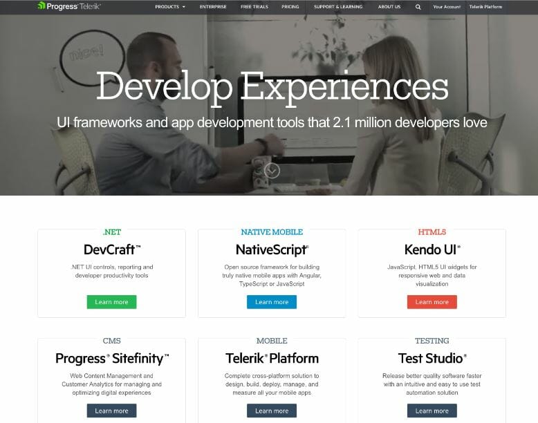
Take the website Telerik by Progress, for example:
For a company offering many technology products, its fun designs, bold colors, and videography presents a Google-like feel. Just one vital aspect of making users feel welcome and letting them understand they’re dealing with real people.
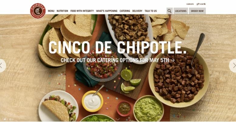
Another case study is Chipotle, the food photography on the homepage is detailed and beautiful, and a quick look at it actually makes you salivate. Now that’s a practical use of visuals.
- Copyright Infringement
Creating and using material that is genuinely yours is common sense. However, ripping off other website’s content and materials is not only unethical but is also illegal, and could land you in a severe problem.
You, therefore, want to avoid using any material that is not yours while designing your website, especially without giving proper attribution.
This single practice has landed many people in trouble. For example, according to the Hot New Hip Hop website, Spotify was recently sued For 1.6 Billion dollars for using thousands of songs without a license:
I’m sure you don’t want to have such an experience.
There are specific guidelines and rules to copyrighted material which you have to check out, including the Fair Use Act.
For more information, visit fairuse.stanford.edu for proper explanations of how the internet and copyright infringement work.
- Be Mindful of Ad Overload
When it comes to website design, you have to consider search engine optimization. Because search engines can be a source of traffic and lead generation channels for your business. Ad overload can hinder you from achieving your website goals.
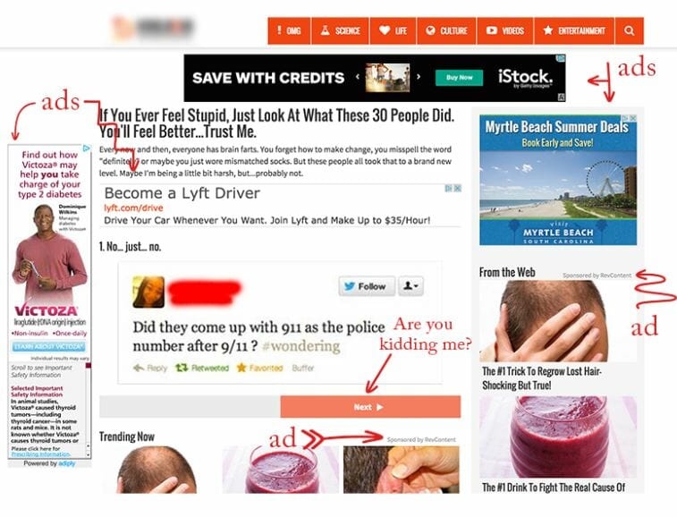
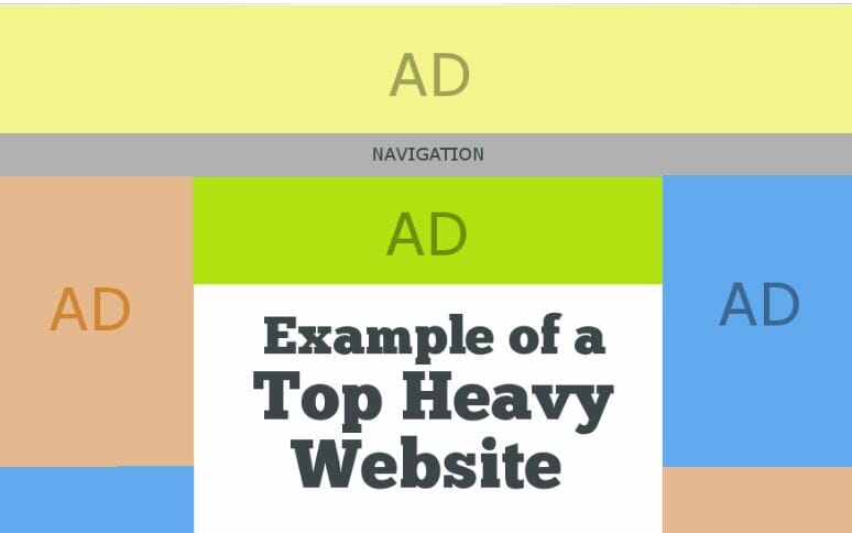
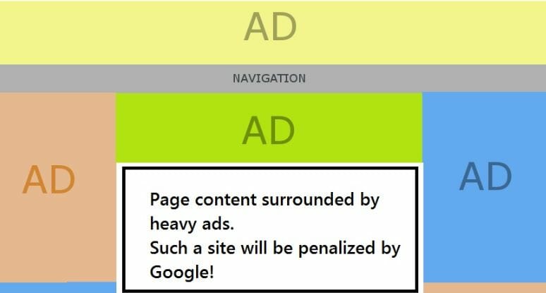
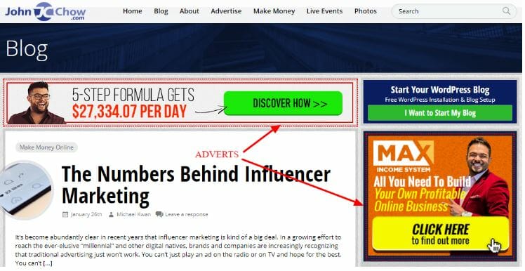
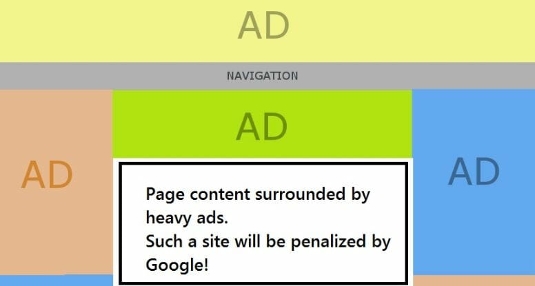
Here’s an example of an Ad-Heavy website.
If your website design is poor, it can affect your search rankings.
Here are some of the ways ad overload on a website can affect its performance in the search engine results:
i). Search engine crawlers are lazy: The truth is, the ads on your website do more harm than good to your website. It hinders users from enjoying the informative content (if any) on the page. Worse, it makes it difficult for search engine spiders or crawlers to easily crawl the website.
Make no mistakes about it, spiders don’t like ads because it slows them down, and they are especially dissatisfied when there’s too much work required to get to your content. If you make the work of crawling your website extra hard for the search engine spider, it will just move onto the next website.
You’re aware there is a lot of content out there, and the spiders use a lot of resources. Stress them, and they will devalue your website.
It all boils down the to the number of resources Google has set aside for indexing your website. This is known as “crawl budget.” Though there’s no constant or set limit to the crawl budget, as every website has its audience and uniqueness.
However, when the resources for crawling your website is being called, the spider can dump out of the crawl of your website because there’s too much demand in the server which causes a delay in page rendering.
ii). Page rendering delay: One of the disadvantages of using Ad networks is they fail to compress images and make them ready for your websites. Their promotional banners are designed and optimized for their own websites, and not yours.
If there are scripting errors, or you have to load content after the ads are displayed, this can cause the search engine spiders to wait for the rest of the DOM? This can inadvertently hinder the crawler from indexing your website or doing it properly.
Image source
A friend of mine got 300k pages on his websites indexed. Next, we checked their ads and fixed every obvious issue, and this helped Google crawler to regularly crawl over a million of their pages.
Note: Ads themselves are not entirely bad. After all, they can be a source of income for your business. However, Ads can increase page redundancy if not implemented intelligently.
iii). Is your website top heavy: If you recall in 2012, Google announced the “Top Heavy” algorithm, which was primarily designed to prevent websites that were “top heavy” with ads from getting optimal organic visibility in the search engine results.
In like manner, Google has reviewed their rules with respect to Google AdSense, which suggests that they may be taking this algorithm change to a different level.
Google allowed 3 AdSense units per page initially, but it will now tag a page that has more advertising than publisher-provided content,” as being manipulative. It could lead to a penalty.
Where does this leave us?
For AdSense publishers, in particular, they should expect their pages that contain more ads than content to be devalued. Worse, they could be banned from the network. If you decide to view your page as rendered, do you see informative and useful page content or advertising?
To stay safer, make sure your page content is visible, useful, and more prominent than advertisements. Because the content is why people use your website, and not because of the ads.
Overall, the algorithm isn’t concerned about single page errors because it looks at page aggregates. That means there’s no cause for alarm if you only have a few pages with poor content and heavy ads.
But if you’re using an Ad Template across your websites and its pages and there are more advertisements than the articles, videos, podcasts, and other content archetypes, you need to review this and find a way to balance the two.
We need to look at ads from an entirely different angle. Why?
Because affiliate marketing is currently one of the best means of creating residual income on the internet. Advertisements are placed onto web pages that visitors are expected to interact with.
Once a user clicks on the ads, he is redirected to another website, and if they eventually complete the transaction, the webmaster gets a small amount of payment as commission.
The whole thing sounds enticing, but the sad thing is that having a lot of adverts on your website will drive traffic away in dozens. Web surfers have become cautious of ad overload on websites.
Some people can place ads in a deceptive manner thereby making the user think they are clicking on a link that’s in-house, whereas it’s an external ad link.
And once they have been redirected by the advert, they will most likely never return to your website. This makes the user feel deceived. Consequently, they will abandon your website for your competitor’s.
That’s not all; it equally gives your website a cluttered feel and makes it difficult to navigate. Though it’s good to have a few tasteful and relevant ads on your website which could possibly help you in generating revenue — but don’t overdo things.
Conclusion
At the end of the day, website design can be entertaining, beautiful, and innovative – but it equally needs to be functional. Useful websites do not need to have boring designs. It’s critical that they have a smart design with a good user experience; that’s all that matters.
All the website design best practices shared here will definitely help you to create a stunning, and successful website in 2018 and beyond.
Is there any website design best practice we did not mention here? Share your thoughts in comments section below.

