Checkout page abandonment has always been a cause of concern for many e-commerce websites. Often times, this happens because the website owners are more focused on their own business objectives rather than the requirements of the customer. A checkout page has several elements that can be optimized based on the needs of the potential customers. This simple practice can do wonders to your conversion rate.
If you have ever purchased anything online, you would agree that all buyers want to complete the process easily, quickly, and securely. Forcing visitors to register or create an account can very easily increase your cart abandonment percentage significantly. If you at all have any forms for them to fill in, make the process easy through good design.
The sole focus of a checkout page should be on checking out. Your potential customers will get confused if your focus is elsewhere. As we all understand, most of the confused people will opt out instead of converting. One easy way to keep your checkout page focused is the incorporation of calls to action. A well designed call to action will help visitors understand your intention. Make sure that your call to action stands out by using a color that has not been used anywhere else in the page. Also, the bigger your call to action is, the more effective it will be in grabbing people’s attention.
Always try to remove all clutters from your checkout page, if possible. By clutter, I mean anything that does not target towards your checkout page’s main objective. Outbound clutters can be particularly harmful because they may divert the visitor to another page.
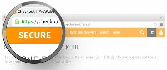
Safety signs are very important elements of a checkout page because all website visitors feel safe to view a page or site that is hacker proof and malware free. This is particularly true for checkout pages because they want an assurance about the safety of their financial transactions. While collecting card details from customers, do not forget to display all security credentials you have. This will reassure them that their information is in safe hands. Add clarity to your payment options by displaying the logos of the different companies.
Include a progress bar in your checkout page because this helps your prospective buyers understand how far they are in the checkout process. If possible, make your checkout process a short one without too many steps. Inline validation is yet another factor that can positively influence your checkout page. This shows whether one has filled in the details correctly and increases the likelihood of more people completing the process.
Do not forget that it takes moments for a prospective customer to change his/her mind. This is why your website needs to have a high loading speed to have a higher conversion rate. Unexpected costs at the final stage results in many opt-outs. Therefore, inform your customers about every associated cost before they enter the checkout process.
Rank Secure is a renowned name in today’s business fraternity offering top of the line SEO and web development service. Thanks for visiting this page and please come again.


